Carolyn A. Uhl, Ph.D.
Researcher
Project 2: Valley Dairy Website
This project began with a cognitive walkthrough of the site, where any issues users might face as they attempted to navigate through the interface were noted. A hierarchical task analysis was completed in order to gain a deeper understanding of the interface's navigation and the steps required to complete each task. User testing sessions were then conducted in order to get an idea of how users experienced the interface. I noted common themes across testing sessions and compiled a cohesive report to submit to the client. Lastly, taken all of the information gathered into consideration, I conducted a heuristics evaluation using Jakob Nielsen's 10 usabilitly heuristics for interface design.

The Valley Dairy homepage, prior to the start of the project.
The original website was analyzed using Jakob Nielsen’s 9 out of the 10 heuristics for User Interface Design. The original website was successful for the following heuristics: user control and freedom, recognition rather than recall, helps users recognize, diagnose, and recover from errors, and help and documentation.
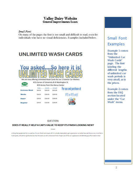
The original website was unsuccessful for the following heuristics: visibility of system status, match between system and the real word, consistency and standards, flexibility and efficiency of use, aesthetic and minimalist design.
I then completed a hierarchical task analysis, consisting of both written steps and a decomposition diagram, which involved focusing on decomposing a high-level task into subtasks. This allowed me, as a researcher, to better understand the interface's navigation and the steps required of the user in order to successfully complete each task.

Hierarchical Task Analysis,
with Decomposition Diagram.

I completed user testing on the existing Valley Dairy website in order to gage how users interacted with the interface and to gain insight from directly from users as they explored the website. This allowed me to note problems faced by users, as well as users’ likes and dislikes about the existing interface. I used this information to complete a report, which was presented to the client.
Sample from User Testing Report
The content of the website was organized in a way that made sense to us, while keeping the user testing results in mind.
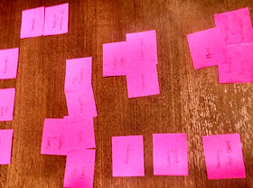
Affinity Diagramming
All information gathered was taken into consideration and a comprehensive report was presented to the client.